SHOWCASE
Galliford Try Phase 1
Galliford Try wanted a clean, intuitive app style interface for their BMS as the system is used across the whole organisation, presented in a style accessible to all.


Background
Galliford Try wanted a clean, intuitive app style interface for their BMS as the system is used across the whole organisation, presented in a style accessible to all.
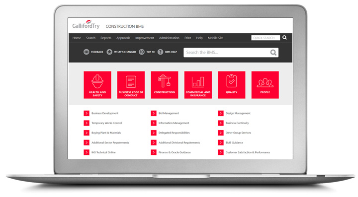
The homepage shows the six top level business areas which have large app style buttons with bespoke logos designed for them. The search field is much more prominent and they have included resource links for What's Changed / Top 10 processes / Feedback and Help.
Level 2 menu options are presented in three different columns/categories (Policies/Processes, Guidance, Forms and check sheets). This design is the basis for Libraries within other operating companies of Galliford Try.
Galliford Try have recently updated their homepage.
Architecture
Click system
Related Design
Galliford Try Phase 2


