New Charter Group
New Charter wanted a design that had the broadest appeal to people right across the organisation from first-line staff to members of the management team.

Background
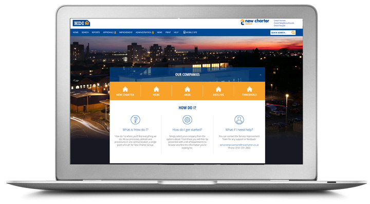
New Charter wanted a design that had the broadest appeal to people right across the organisation from first-line staff to members of the management team. They wanted a design that had a simple, clean, quality feel and was easy to follow since the Library is their principle/sole reference for their ways of working.
New Charter’s design was built to scale. The homepage shows the company selection options which scales with a new row being added automatically if they need to increase the options in the future. There is a broad theme of "How do I...?" which is incorporated into the design to enable staff to find quick answers to their questions. In addition, they have included a button that links through to the Keys-to-Keys process which has been standardised across all companies.
Clicking on one of the companies, takes the end-user to a second level showing the departments. This page also has a ‘Most popular’ button linking through to a third level listing the most popular documents/processes. A stronger feedback mechanism was introduced to encourage staff engagement so they included on the second level a feedback button with a drop down with various options such as Make a suggestion / Report a problem / Get support.
Architecture
Click system
Related Design
New Charter Group is now part of the Jigsaw Homes Group.


